
LockedIn HQ: The Brand Operating System
The Athlete-First Identity & Visual DNA
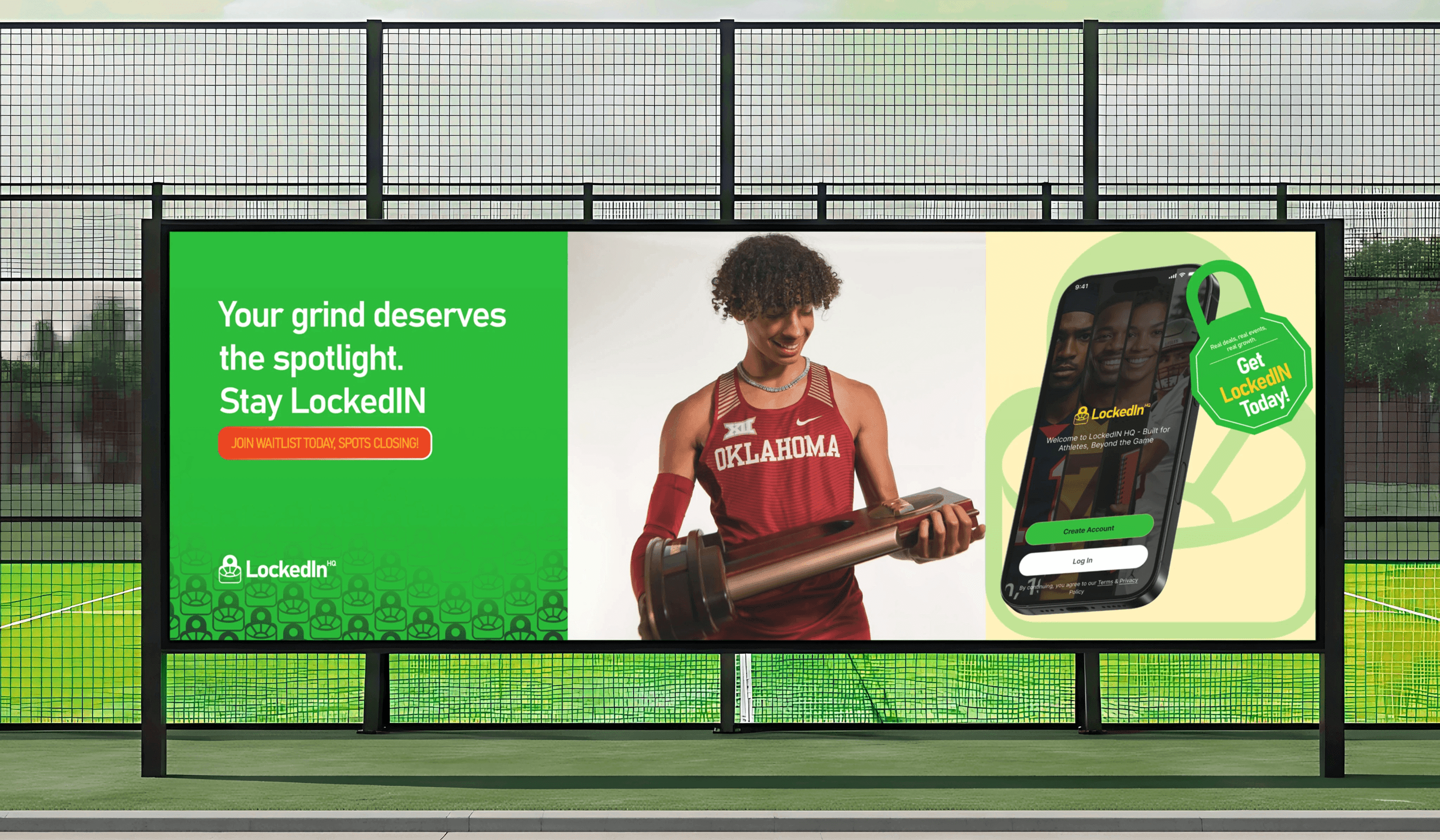
A high-performance visual DNA designed for the next generation of athlete recruitment.
Brand Architecture & Design Governance
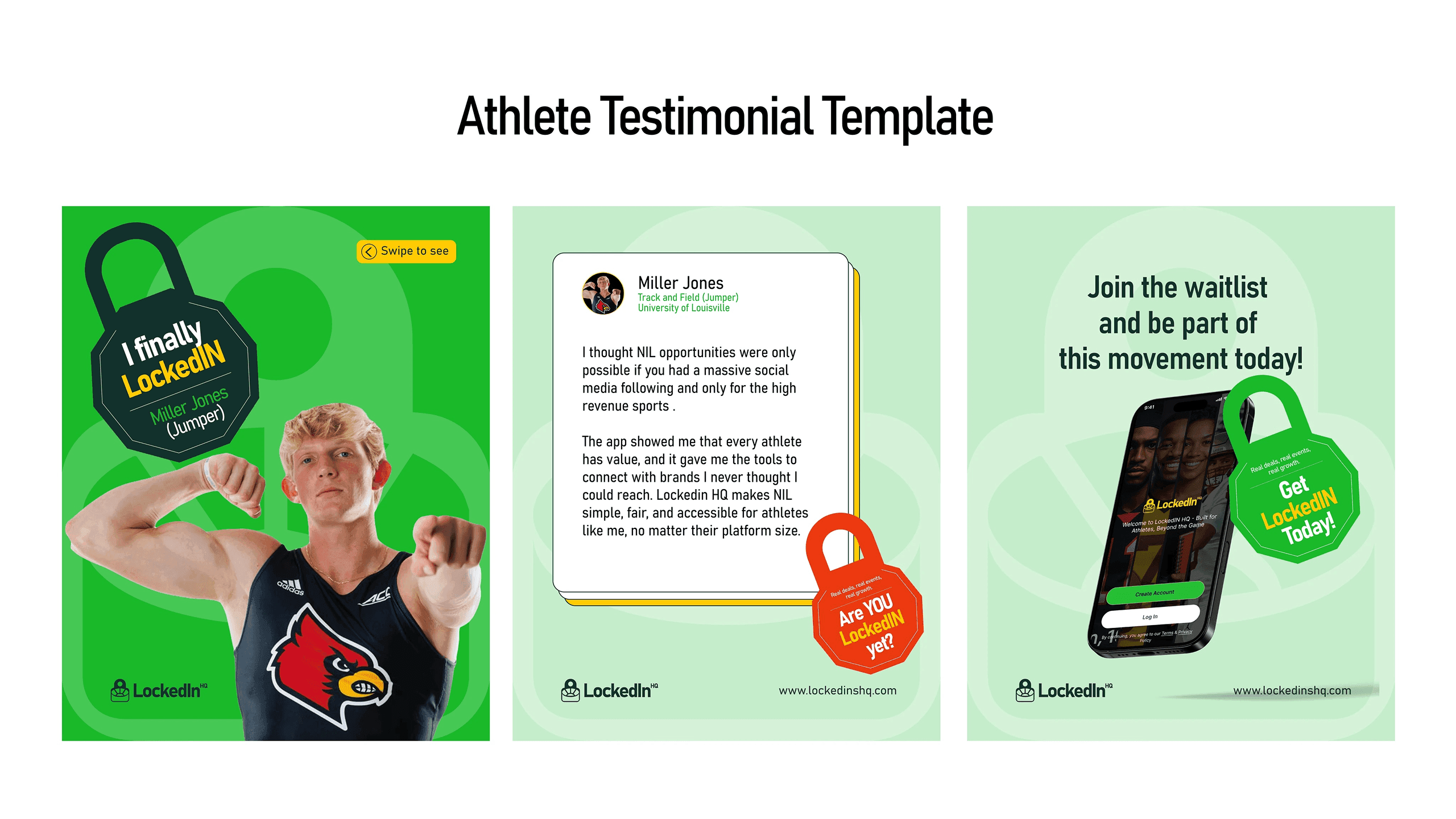
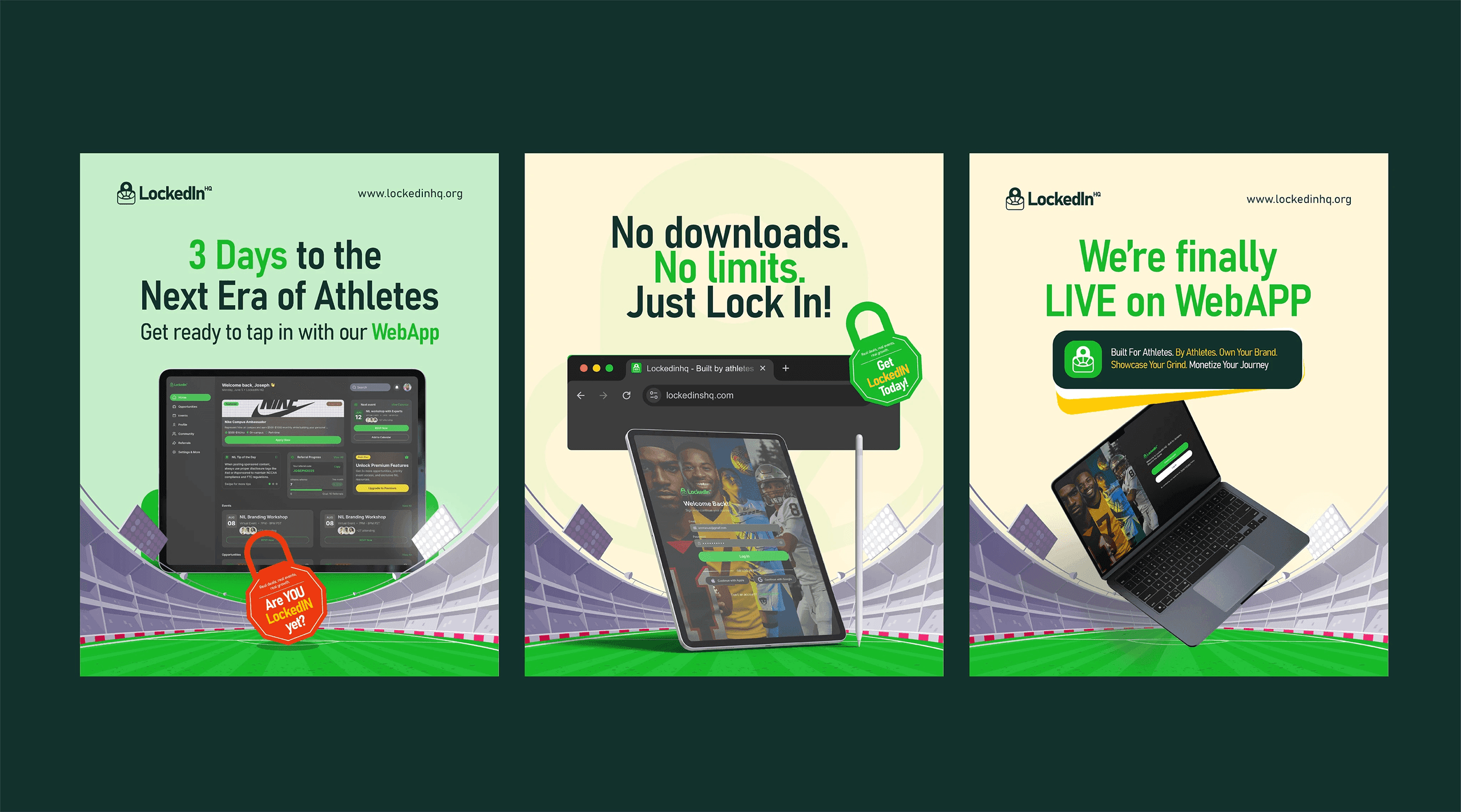
The LockedIn HQ visual identity is engineered to evoke the intensity of the sports world while maintaining the professional polish of a premium athletic brand.
Typography: A high-impact, geometric sans-serif type scale using Inter, designed for maximum readability across stadium displays, merchandise, and digital platforms.
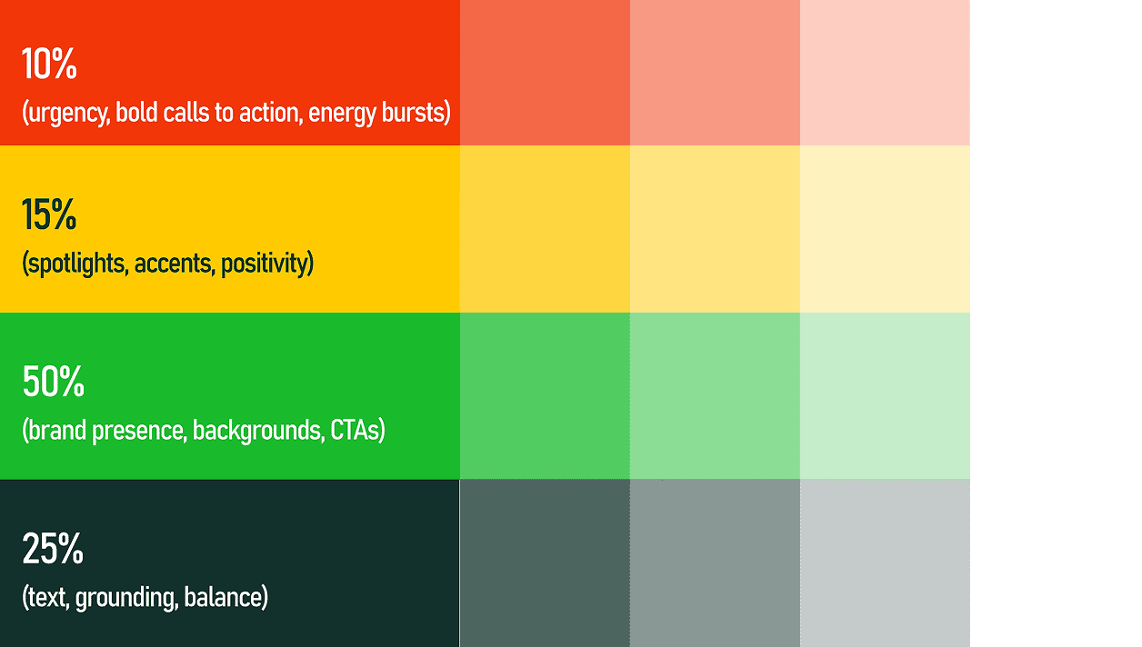
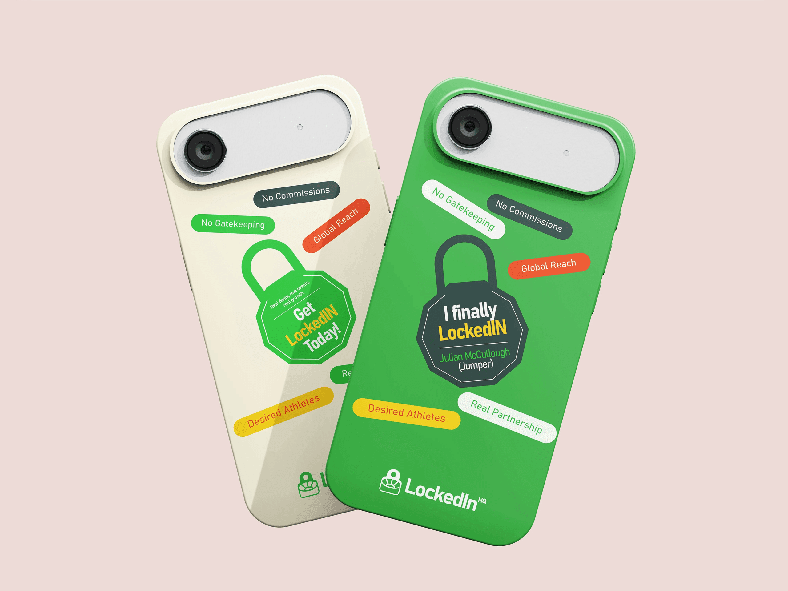
The Palette: A high-contrast Power palette utilizing deep blacks and vibrant athletic accents to evoke energy, focus, and the Locked In mindset of elite performers.
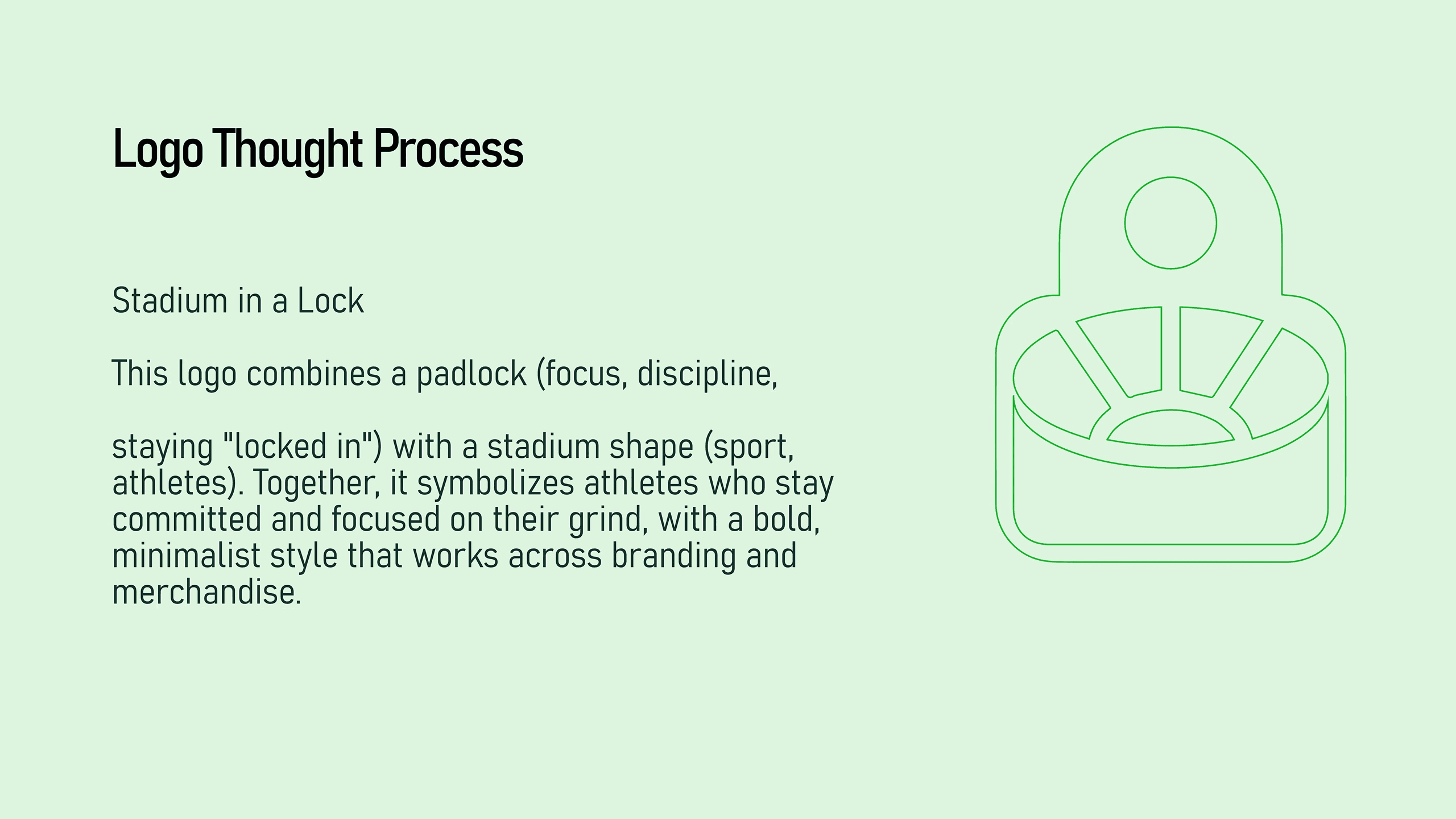
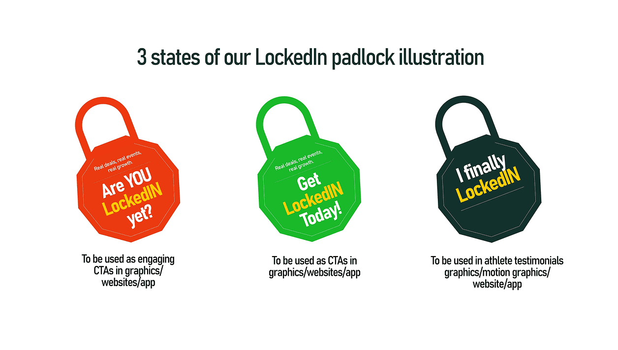
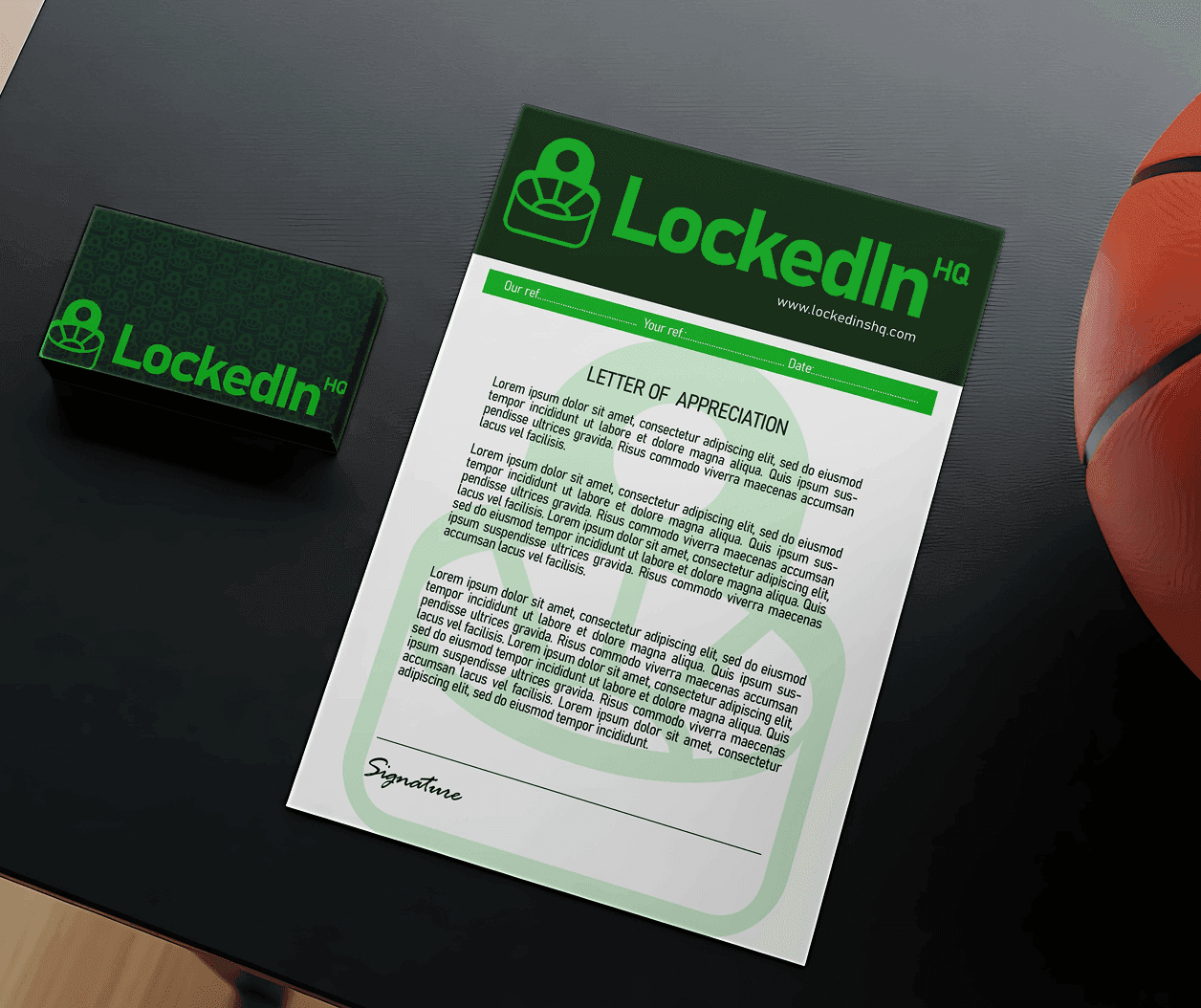
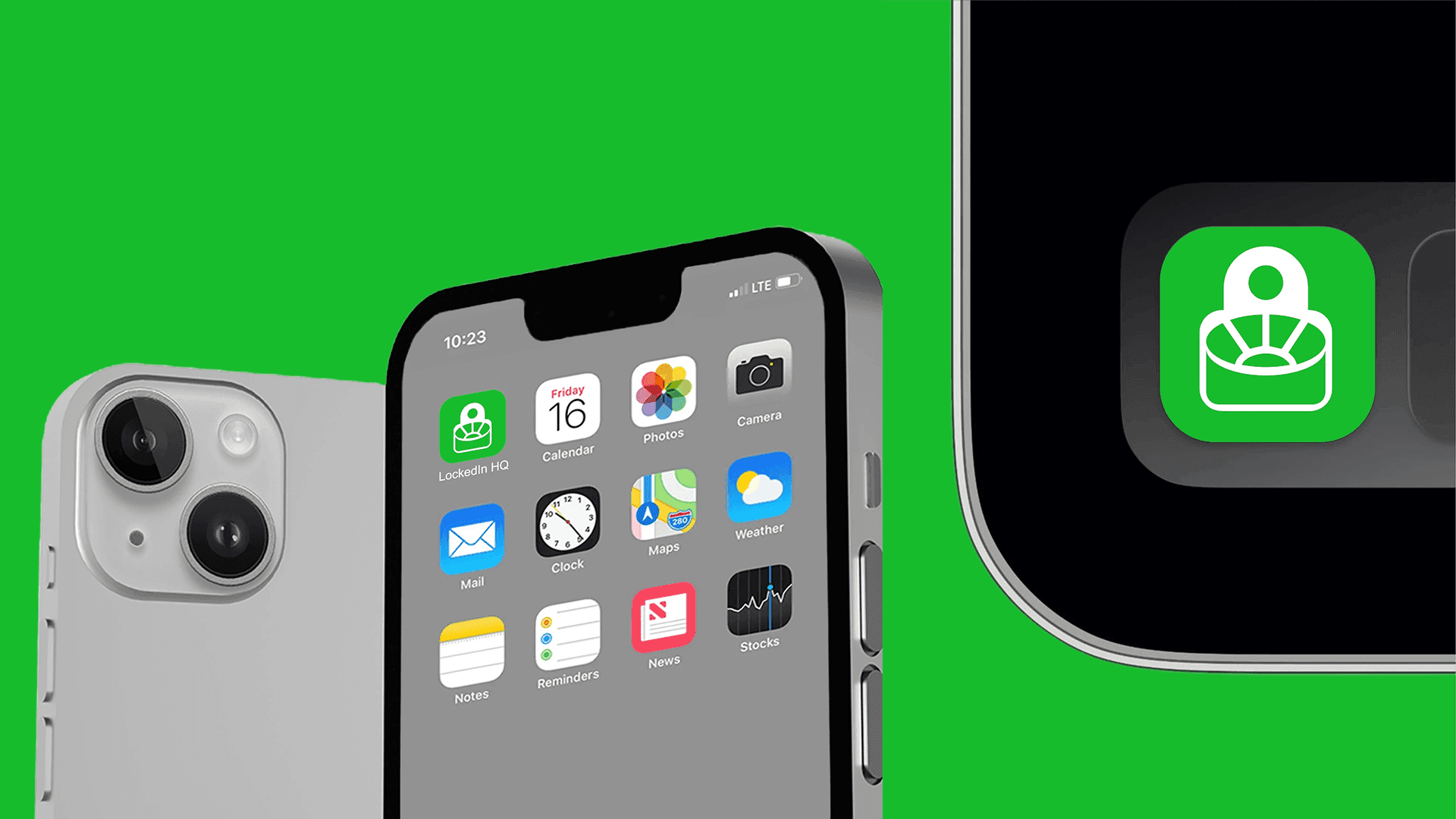
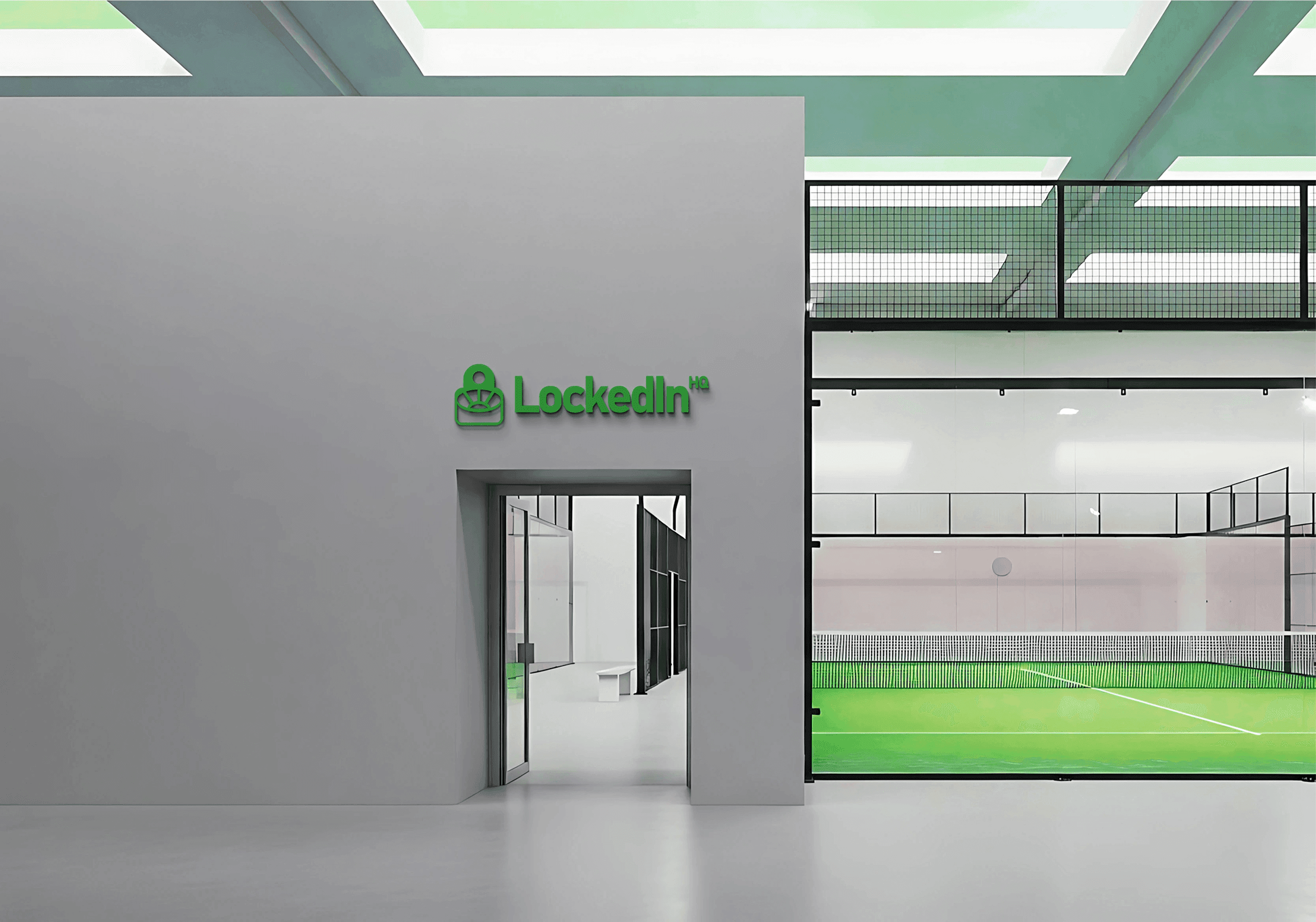
Iconography & Logo: A bespoke Stadium-meets-Padlock mark, symbolizing both the arena of competition and the secure, exclusive nature of the professional athlete ecosystem.
Built for Brand Excellence
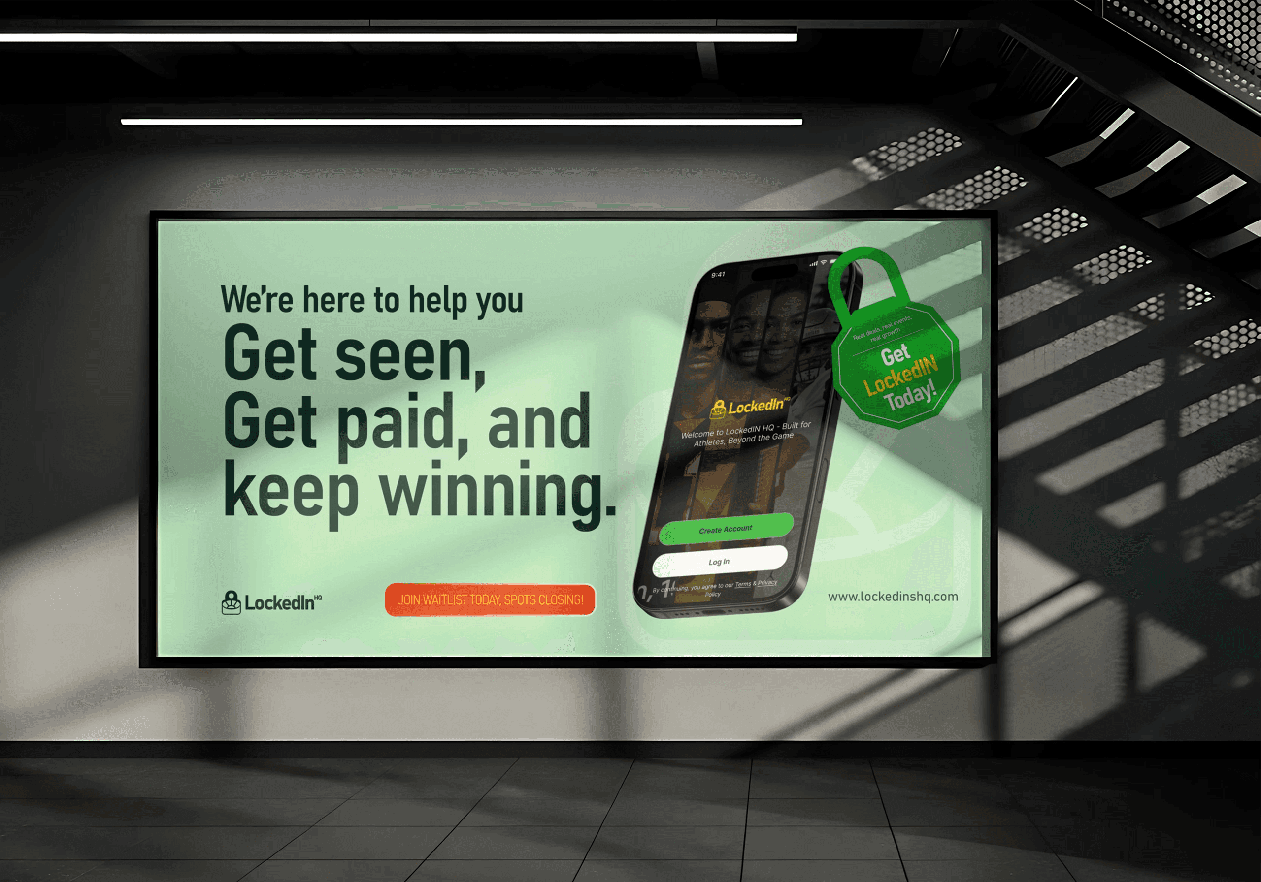
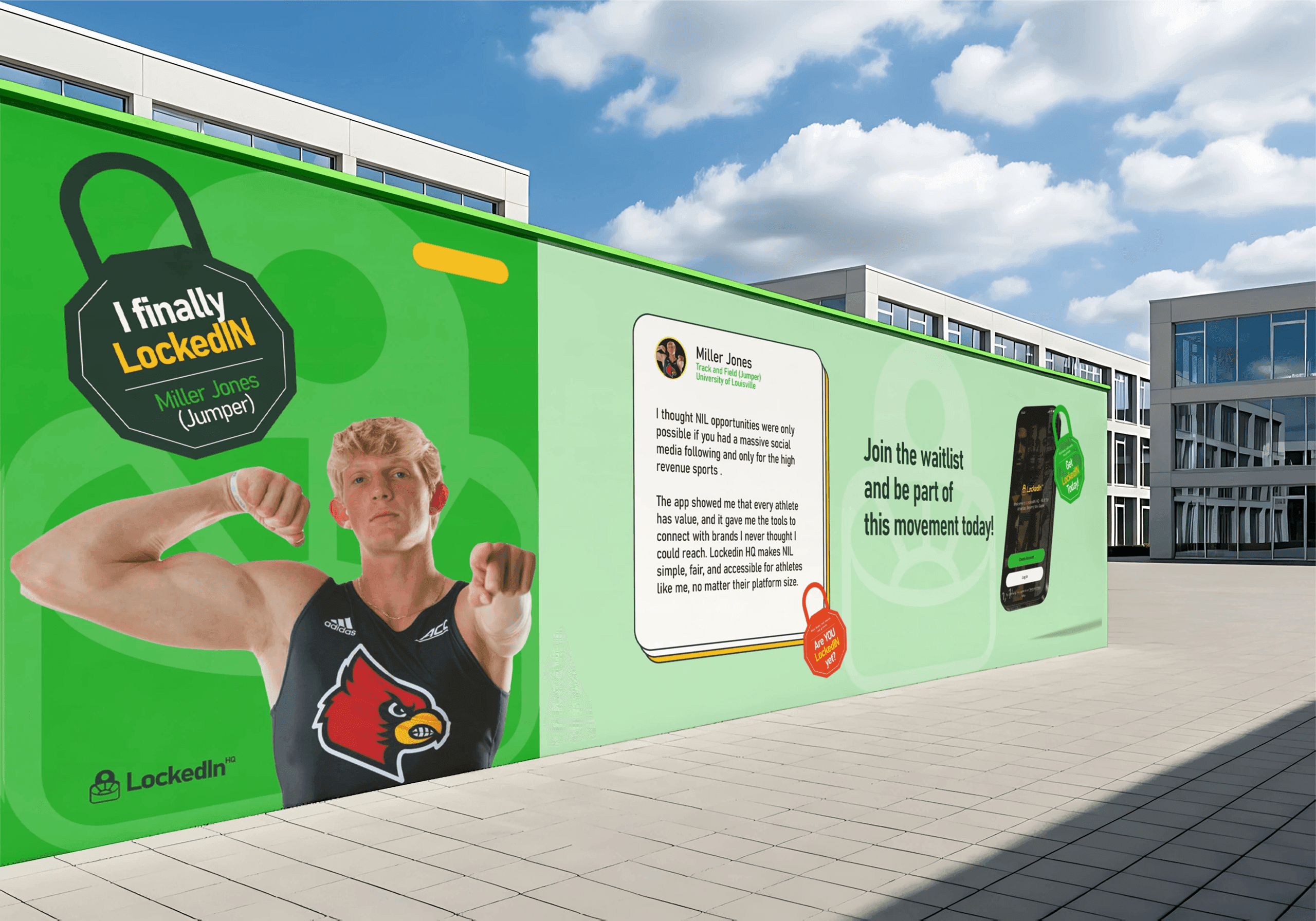
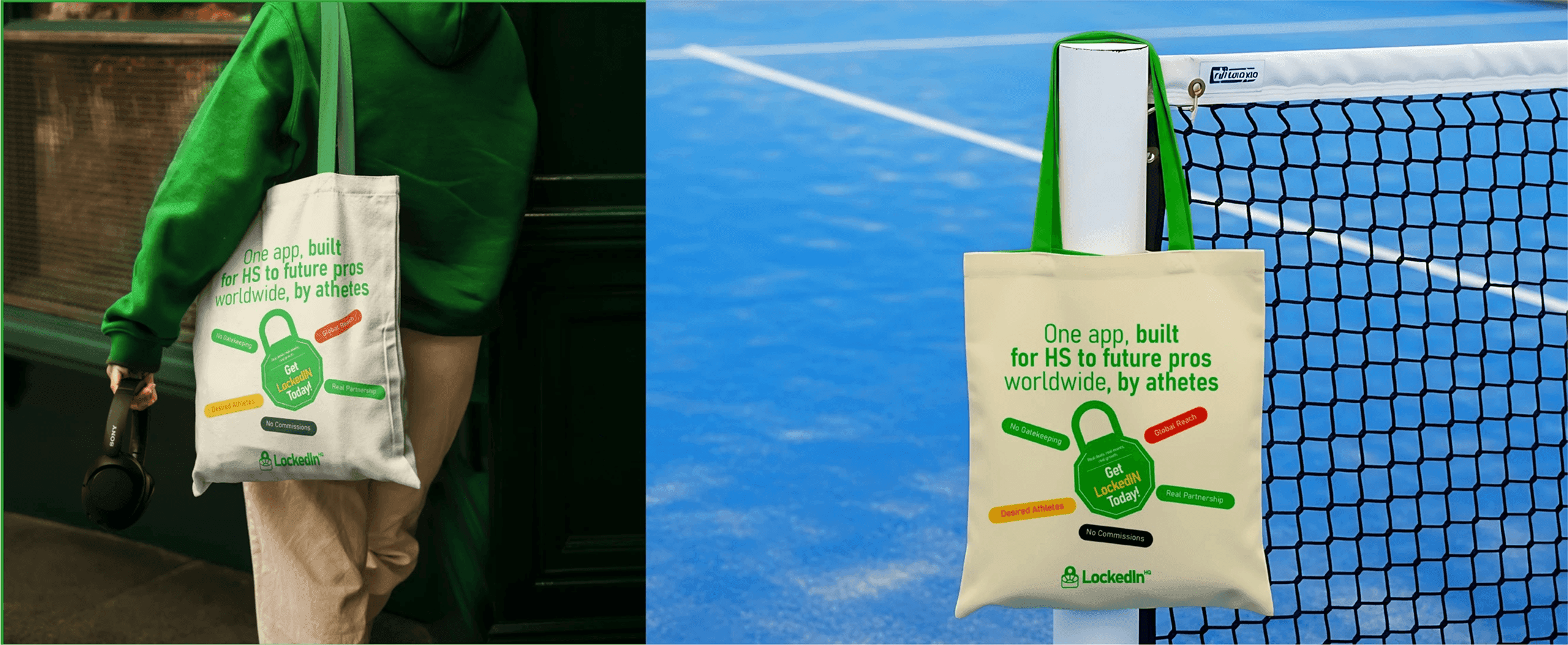
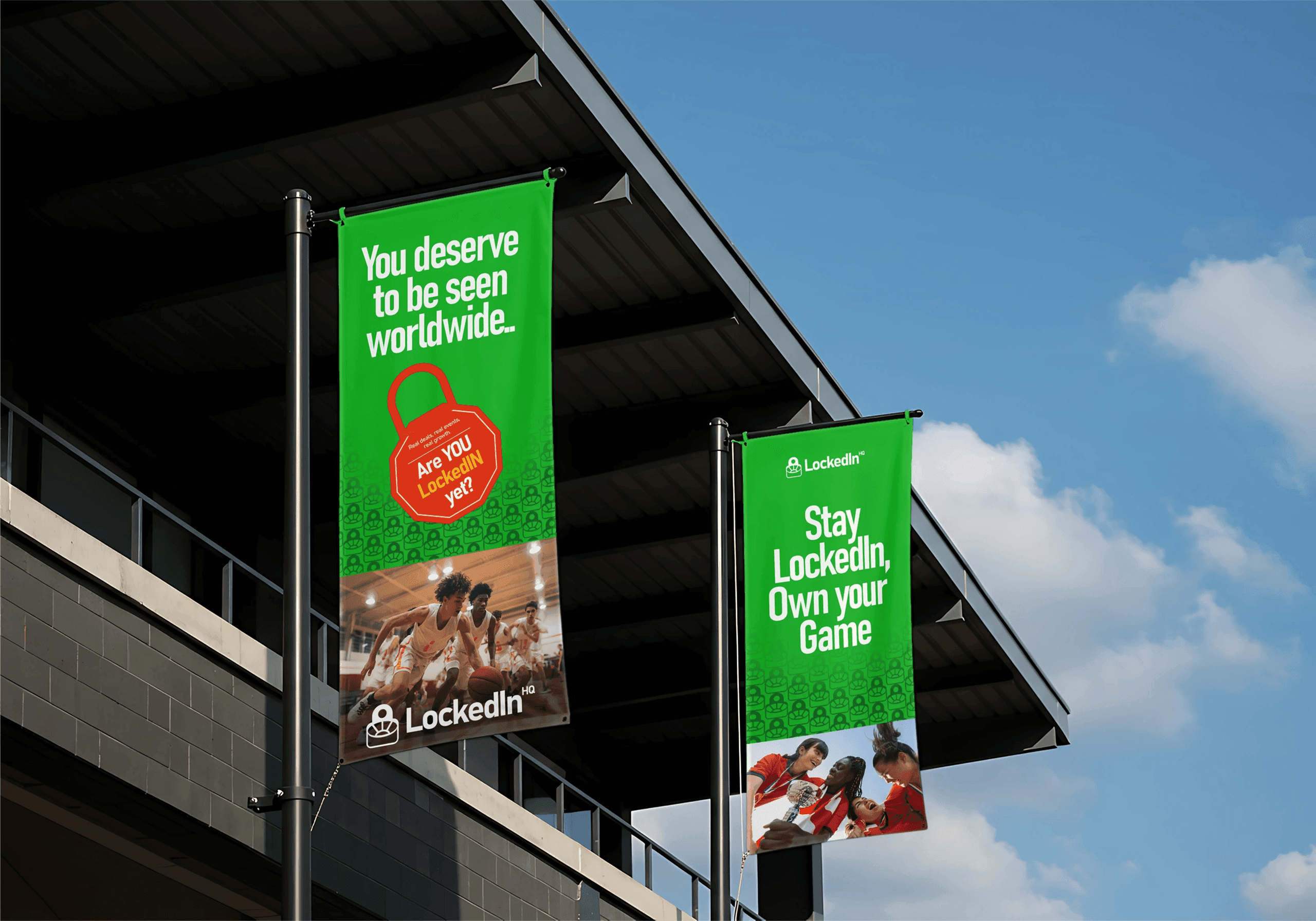
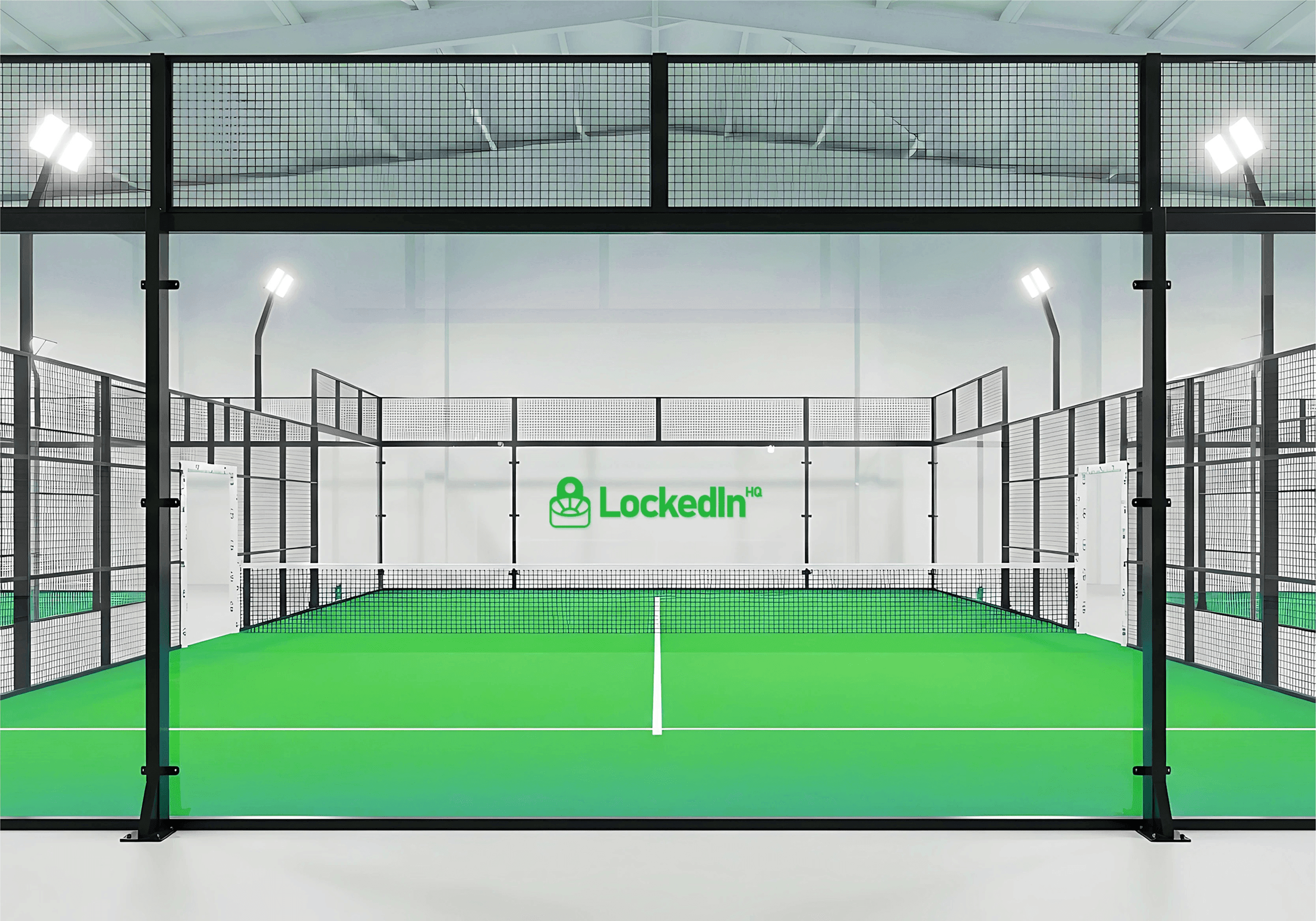
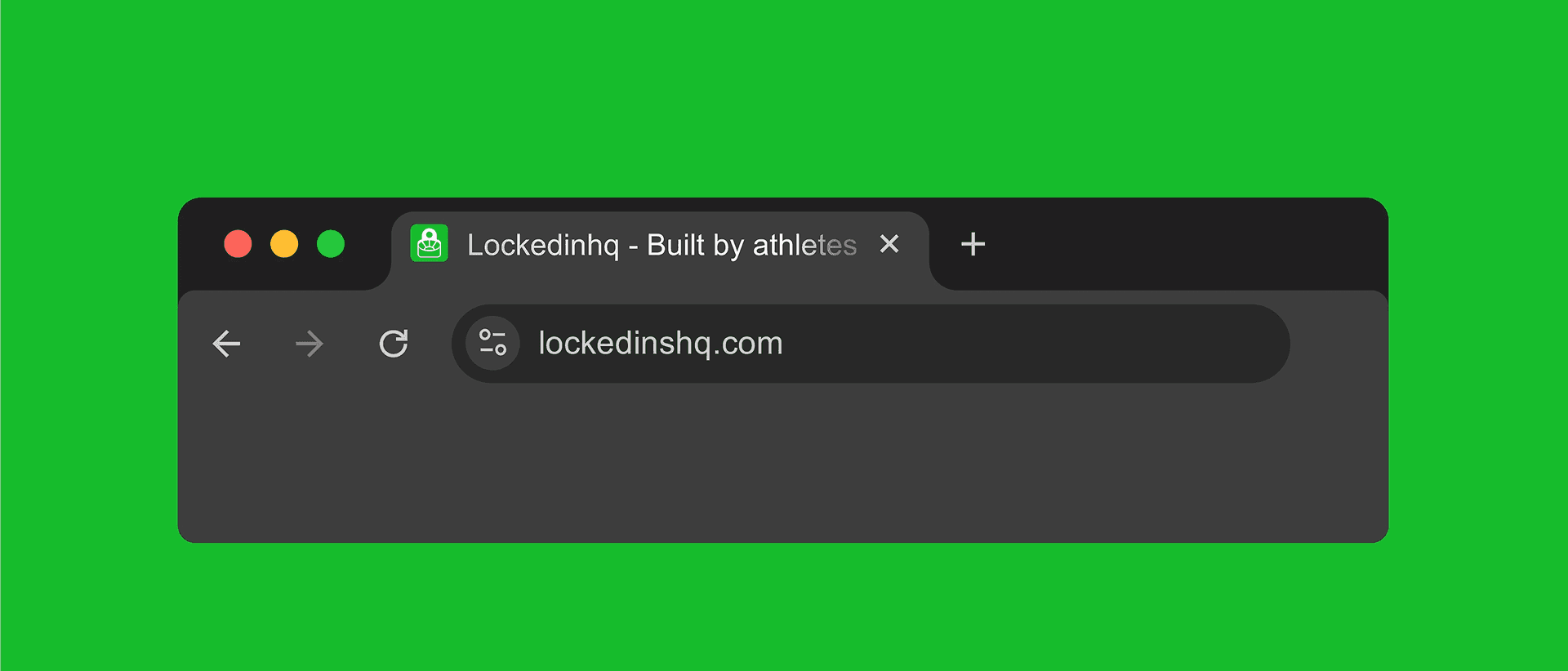
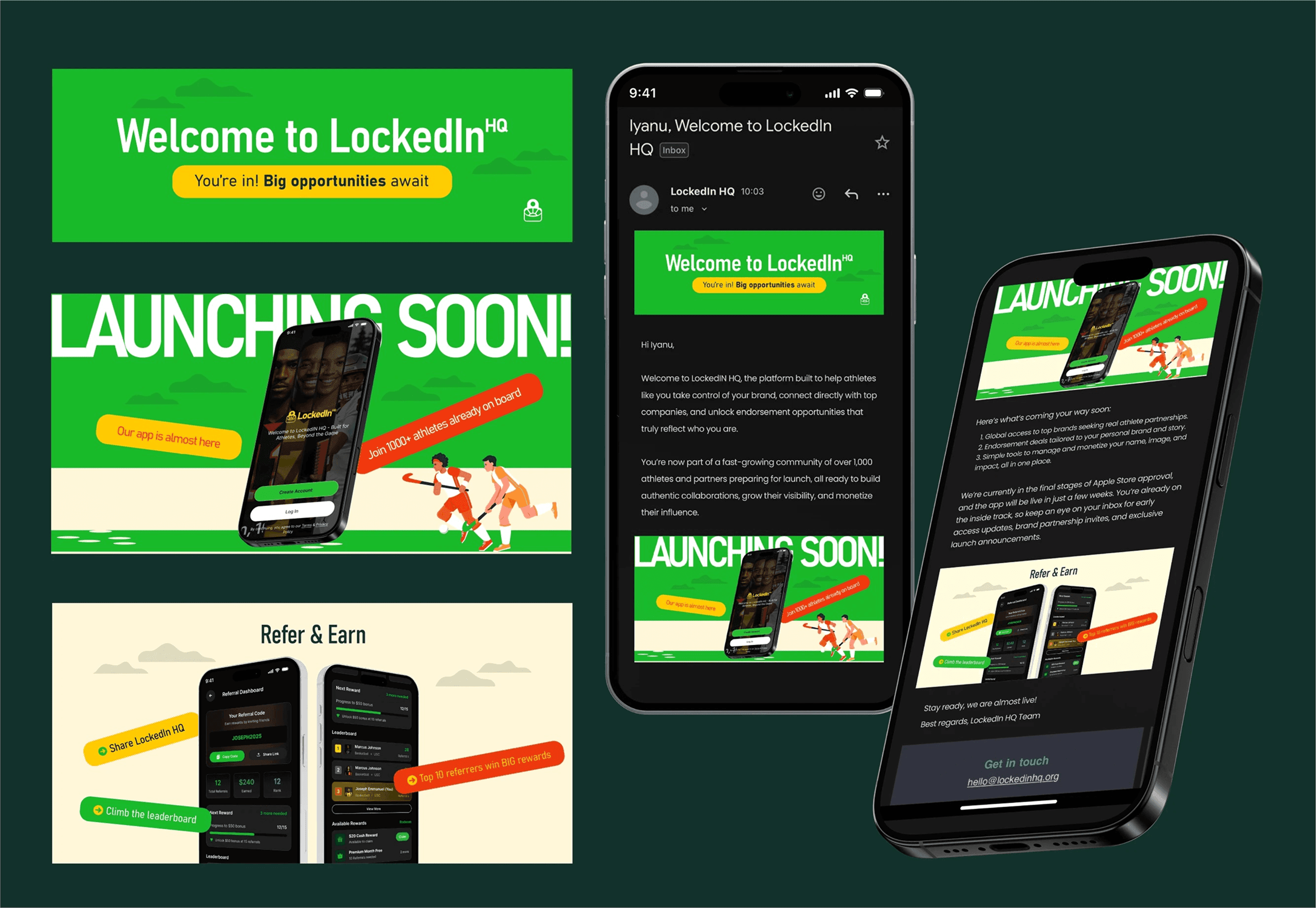
By architecting a rigorous set of brand guidelines, we ensured that the LockedIn HQ identity remains consistent and powerful across every physical and digital touchpoint.
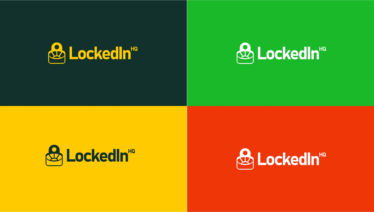
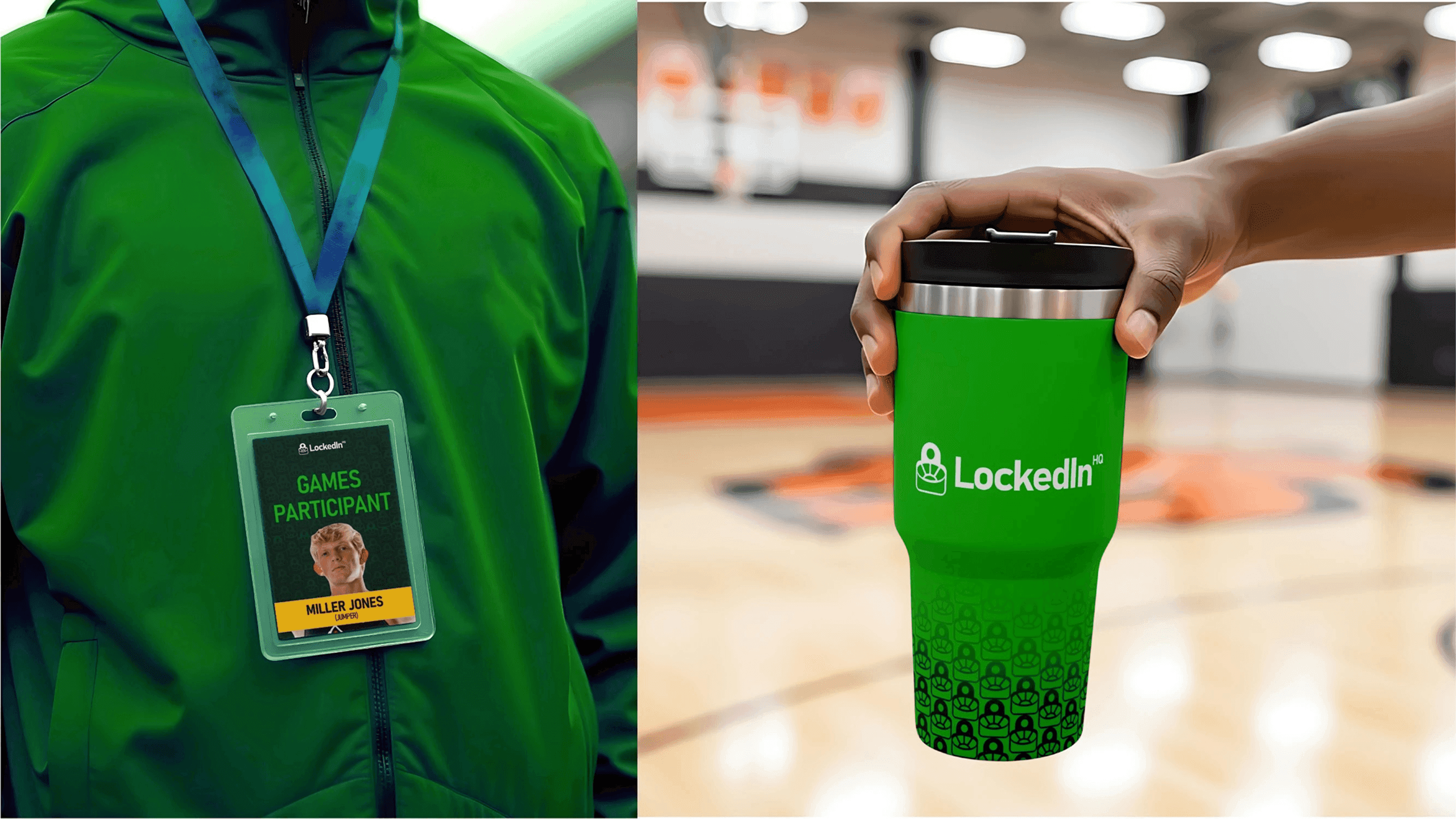
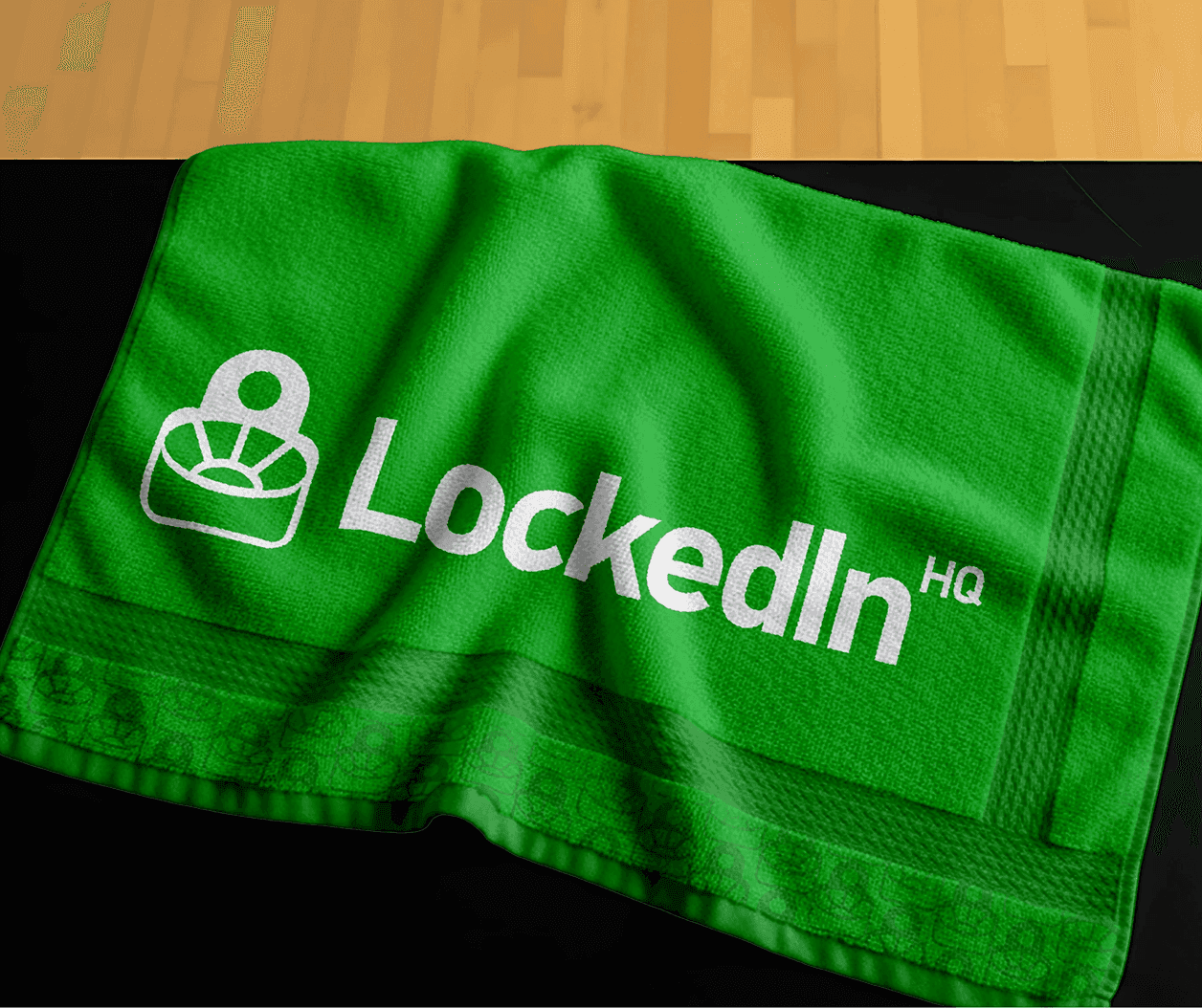
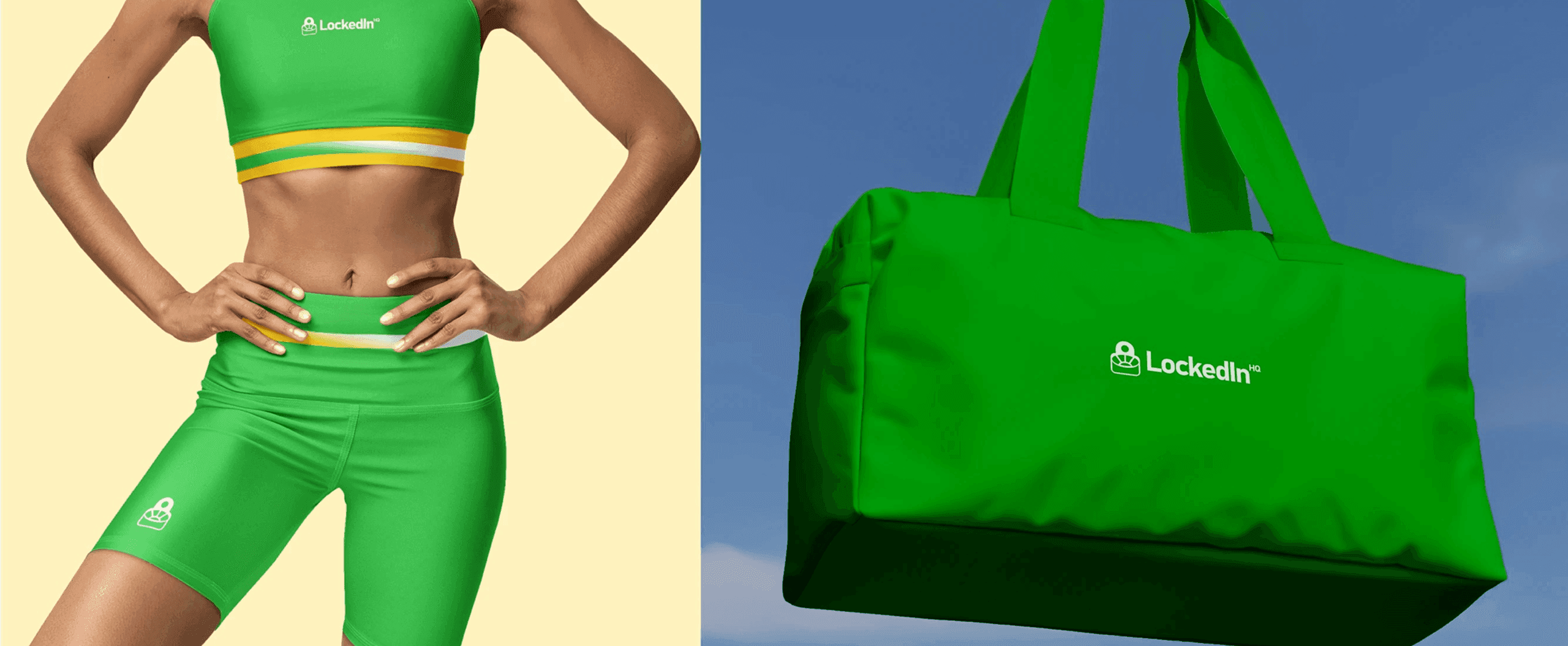
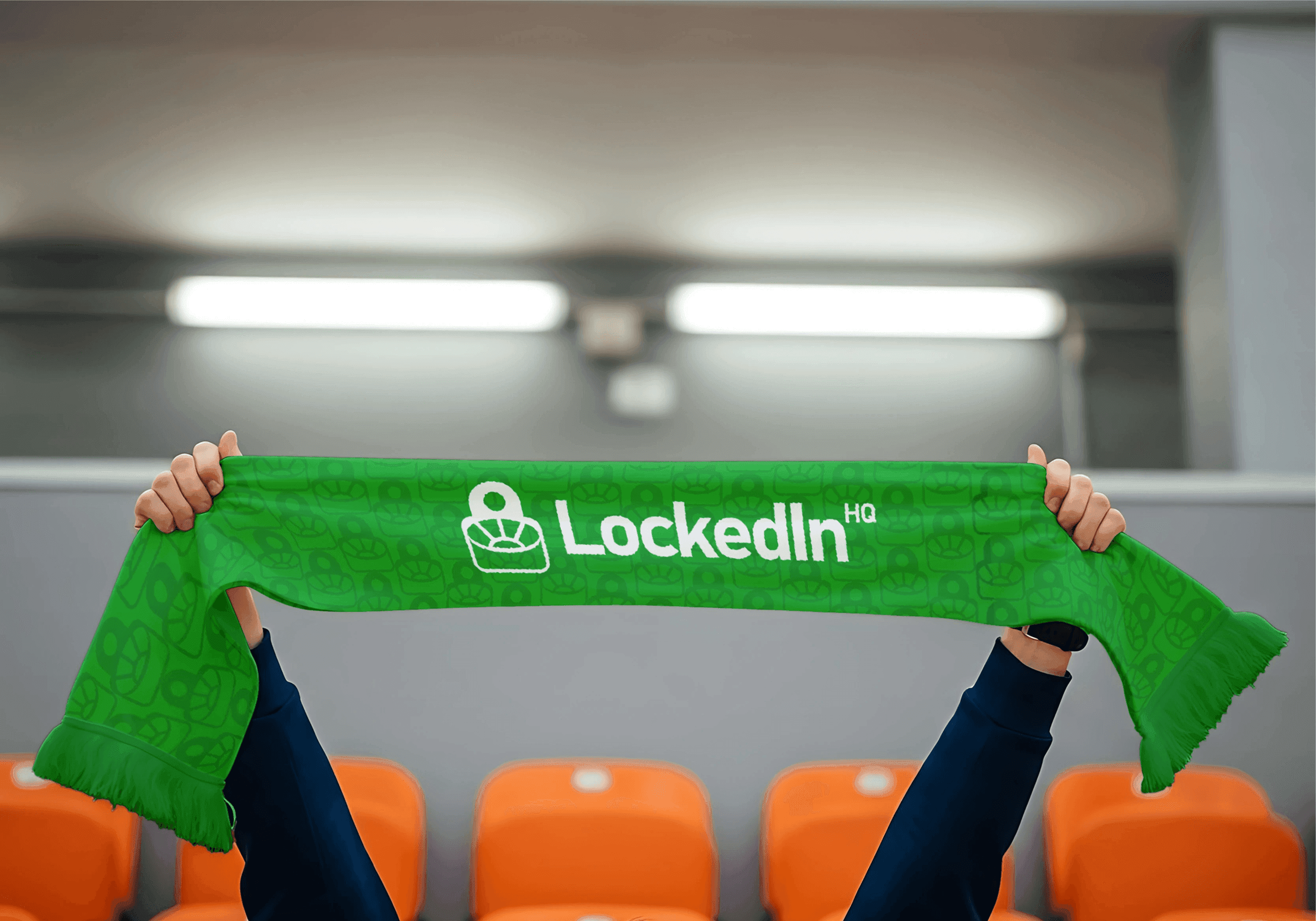
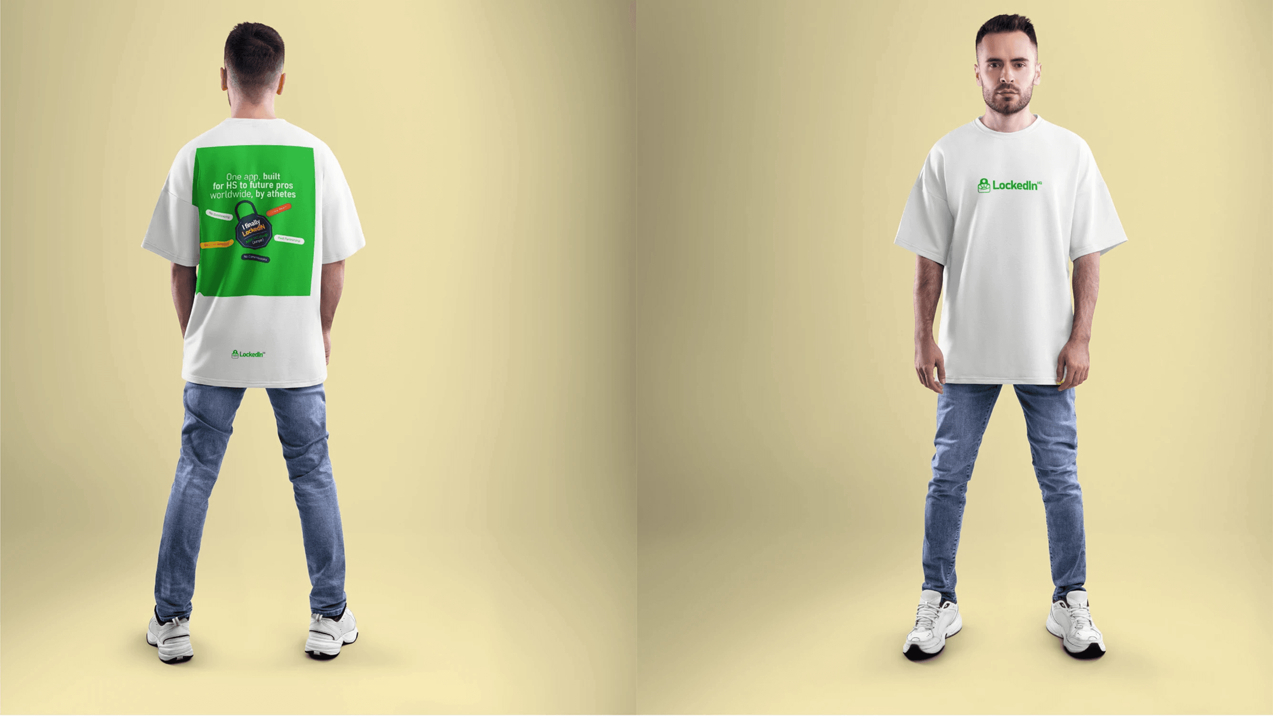
The Visual DNA: A comprehensive logo system featuring primary, secondary, and monochrome variants to ensure versatility from apparel embroidery to large-scale environmental graphics.
Brand Guidelines: A strictly defined Source of Truth for spacing, clear space, and color usage, preventing brand dilution as the company scales globally.
Motion & Material: Guidelines for how the brand lives in the real world, from the matte finish of premium physical assets to high-velocity motion graphics for social media.
The Process
From psychological research to a stadium-ready visual system, we defined the brand logic that powers LockedIn HQ.
Live LinkBrand Research
1 Week
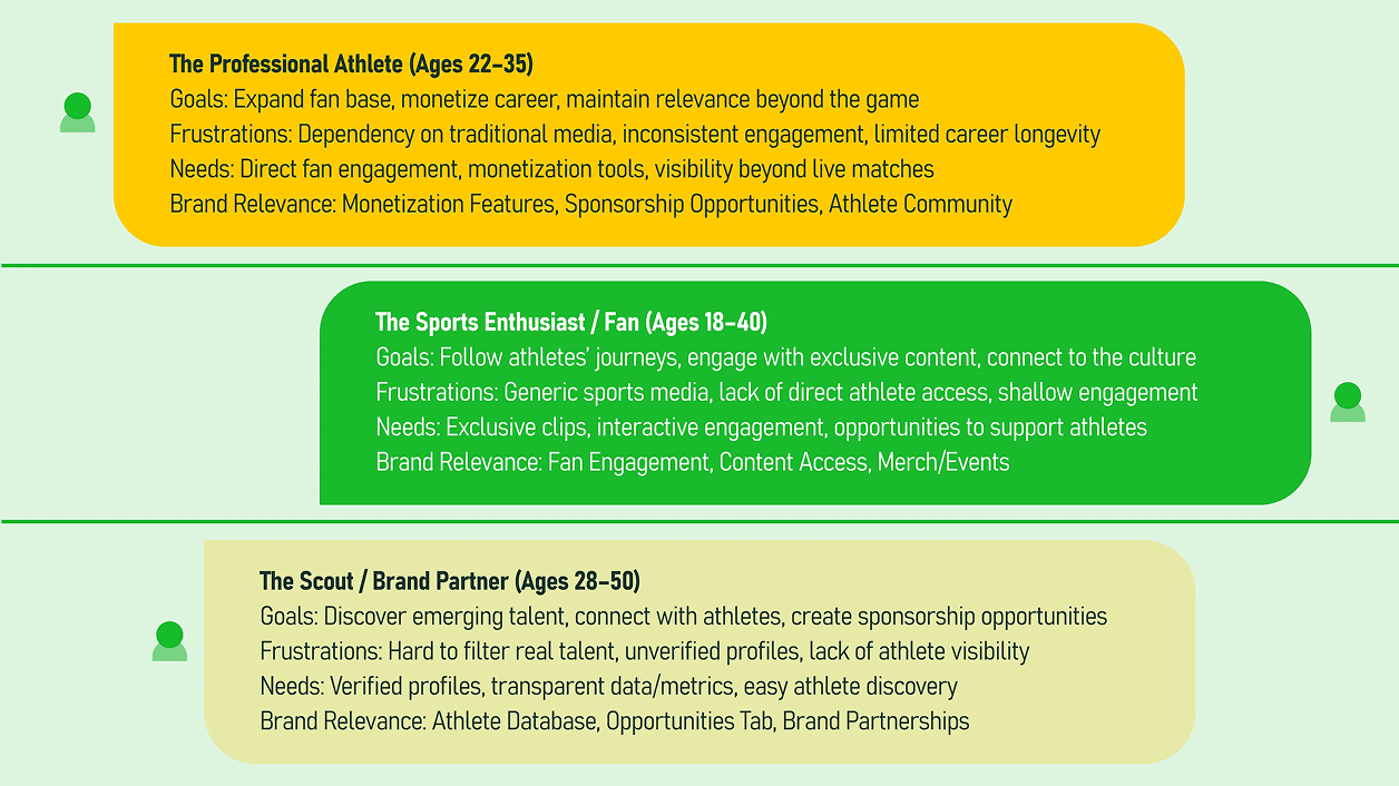
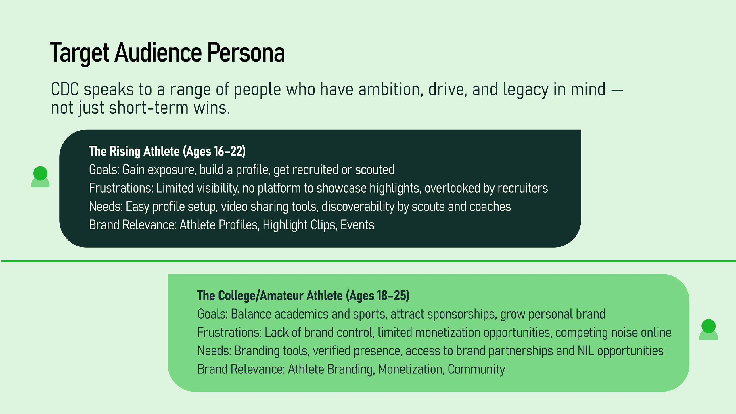
We established a granular understanding of the sports recruitment landscape and athlete psychology to ensure the visual identity resonates with the target audience.
Logo Design & Iteration
12 Days
During this phase, we explored the “Stadium-meets-Padlock” concept, refining the geometry and weight to ensure a timeless and iconic mark.
Documentation & Handoff
2 Days
We delivered a comprehensive Brand Book and asset library, empowering the internal team to deploy the new identity with clinical precision.